
Operable: Making the Site Navigable and Usable
Moving to the second pillar of the POUR acronym, Operable focuses on how people navigate and use the site. While “Perceivable” is about seeing or hearing the content, “Operable” is about ensuring the interface doesn’t require interactions that a user cannot perform.
For many users with motor disabilities, a mouse is unusable, so the website must be fully functional via a keyboard or voice commands. The Operable principle ensures that the website’s navigation and interactive elements do not require actions, such as precise mouse movements or rapid clicking, that a user may be physically or cognitively unable to perform.
Why these topics fit under Operable
Keyboard and Focus
An interface is only “operable” if its controls can be reached. For users with motor disabilities, the keyboard is the steering wheel; if the site doesn’t respond to it, the “vehicle” is inoperable.
User Control and Safety
Operating a site should not be a “race against the clock” or a physical hazard. If a user cannot stop an animation or finish a form before it clears, they have lost the ability to operate the interface.
Wayfinding and Orientation
To operate a complex system, you must know where you are. Descriptive titles and clear paths provide the “labels” and “signs” necessary to navigate the site without getting lost or stuck.
Keyboard and Focus
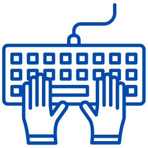
Keyboard Accessibility
- The Goal: Ensure every interactive element (links, buttons, forms) can be reached and triggered using only the Tab and Enter/Space keys.
- Why it Matters: Many users with motor impairments or tremors rely on specialized keyboards, switches, or mouth sticks. If a button only responds to a mouse click, those users are effectively locked out of that function.
- Best Practice: Avoid “keyboard traps” where a user can tab into a section (like a calendar picker or pop-up) but cannot tab back out.
Visible Focus Indicators
The Goal: Provide a clear visual “halo” or border (the focus ring) around the element currently selected as a user tabs through the page.
Why it Matters: A keyboard user needs to know exactly where they are on the page. Navigating without a focus indicator is like trying to use a computer with an invisible mouse cursor.
Best Practice: Never use CSS to remove the default browser outline (
outline: none) unless you are replacing it with a more prominent, high-contrast custom style.

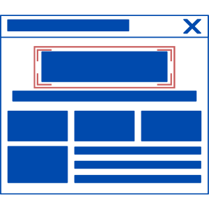
Skip Navigation Links
The Goal: Provide a hidden link at the very top of the page that allows keyboard users to jump directly to the main content.
Why it Matters: For someone using a screen reader or keyboard, tabbing through a massive top navigation menu on every single page is exhausting. This allows them to bypass repetitive headers and get straight to the information.
Best Practice: The “Skip to Content” link should become visible as soon as it receives keyboard focus.
User Control and Safety

Sufficient Time
The Goal: Provide enough time for users to read and interact with content.
Why it Matters: Users with disabilities may require more time to read, type, or navigate. Unexpectedly moving content or timing out a session can prevent them from completing a task.
Best Practice: Avoid automatic page refreshes or scrolling carousels that move too fast. If there is a timeout (like on a secure portal), allow users to extend it.

Seizure Prevention (Flash and Animation)
The Goal: Do not design content in a way that is known to cause seizures or physical reactions.
Why it Matters: Flashing lights or rapid patterns can trigger photosensitive epilepsy. Beyond seizures, moving backgrounds can cause severe nausea or dizziness for users with vestibular (inner ear) disorders.
Best Practice: Avoid anything that flashes more than three times per second. Provide a “Pause” button for any auto-playing animation or video.
Wayfinding and Orientation
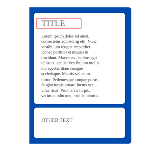
Descriptive Page Titles
The Goal: Use the
<title>tag to give every page a unique, helpful name that appears in the browser tab.- Why it Matters: When a user has multiple tabs open or is using a screen reader, the page title is the first thing they hear. It allows them to quickly identify which page they are on without having to read the content.
Best Practice: Place the specific page name first and the site name second (e.g., “Registration – ITEC Portal” instead of “ITEC Portal – Registration”).

Meaningful Navigation Paths
The Goal: To provide users with multiple, clear ways to find content and understand where they are currently located within the website’s hierarchy.
Why it Matters: For a site to be “operable,” a user must be able to move through it without getting lost. Users with cognitive disabilities or those using screen readers may find it difficult to visualize a site’s structure; breadcrumbs and consistent menus act as a permanent “You Are Here” marker on the map. Without clear paths, a user might be able to click buttons, but they won’t be able to operate the site to complete a multi-step task (like registering for a class).
Best Practice:
Breadcrumbs: Implement breadcrumb navigation (e.g., Home > Resources > ITEC Accessibility Resource Center > Operable) to show the path taken.
Consistent Menus: Keep main navigation menus in the same location and order on every page.
Sitemaps & Search: Provide more than one way to reach a page, specifically a site map and a functioning search bar.
Logical URL Strings: Use human-readable URLs (e.g.,
itec.edu/enrollment/forms) rather than random strings of numbers.