
Perceivable Material
To meet ADA compliance standards, digital assets must be Perceivable. This means users must be able to perceive the information being presented; it cannot be invisible to their senses. Below, you will find guidelines for formatting text, media, and structure to ensure that all users, including those with visual or auditory impairments, can consume our content effectively.
Why these topics fit under Perceivable
Visual Clarity
Color contrast and text formatting (bold, size) ensure those with low vision or color blindness can read the page.
Structural and Navigation Cues
Logical headings, lists, and tables provide a map that screen readers can announce.
Descriptive links tell a user exactly where they are going before they click.
Media and Non-Text Content
Alt text and captions provide a text-based way to “perceive” images and audio.
Complex Data and Documents
Information is often “hidden” within visual layouts like grids or images. Without technical tagging and headers, this content remains invisible to assistive technologies and cannot be converted into sound or touch.
Visual Clarity
This section focuses on making sure text and interface elements are easy to see and distinguish from one another.

Color Contrast
- The Goal: Ensure a high contrast ratio between text and its background.
- The Standard: For WCAG 2.1 AA compliance, regular text requires a contrast ratio of at least 4.5:1, while large text requires 3:1.
- Why It Matters: Millions of users have some form of color vision deficiency or low vision. If the contrast is too low, the text literally disappears into the background for them. Environment, cognitive ease, and eye strain are also factors when it comes to color contrast.
- Best Practice: Never use color as the only way to convey information (e.g., “click the red button”).

Text Formatting
The Goal: Use styling to enhance readability and hierarchy without creating visual confusion or technical barriers.
The Standards:
Size: Use relative sizes (like percentages or
em) so users can scale text up to 200% using browser zoom.Underlines: Reserved exclusively for hyperlinks.
Bold: Use the
<strong>tag for importance rather than just increasing font weight for “looks.”
Best Practice: Avoid using all-caps for long sentences (it’s harder to read) and never use color alone to highlight a word—always pair it with bolding or a symbol.
Structural Clues and Navigation
These elements create a “digital map” that allows assistive technology to navigate the page logically.

Logical Heading Structure
The Goal: Use
<h1>through<h6>tags in a nested, chronological order.Why it matters: Screen reader users often jump from heading to heading to find the content they need. Skipping levels (e.g., jumping from H2 to H4) breaks that flow.

Lists
The Goal: Use proper HTML list tags (
<ul>for bullets,<ol>for numbered steps).Why it matters: When properly coded, a screen reader will announce, “List, three items,” which gives the user context that doesn’t exist with plain lines of text.
Best Practice: Use numbered lists for items that need to be completed in a specific order. Use a bulleted list when order doesn’t matter.

Descriptive Links
The Goal: Avoid “Click Here” or “Read More” and raw URLs.
Why it matters: Many assistive technology users use a keyboard shortcut to pull up a “Links List,” which strips away all the page text and shows only the links. If that list contains ten links that all say “Click Here,” the user has no way of knowing which one leads to the login page and which one downloads a file.
Best Practice: The link text should describe the destination (e.g., “Download the February ITEC Newsletter”). This allows users to understand the link’s purpose even if it’s read out of context.
You do not need to use the word “link” in your link text. Screen readers already announce that piece of text as a link.
Non-Text Content
Since users with visual or hearing impairments cannot “perceive” standard media, these alternatives act as the bridge.

Alt Text on Images
- The Goal: Provide a textual alternative to non-text content so that the “meaning” of an image can be understood by people who cannot see it.
Why it Matters: It allows blind or visually impaired users to “see” the image through their screen reader and provides a fallback description if the image fails to load due to a poor internet connection.
The Standard: Every image must have an
altattribute.Informational images: Describe the content (e.g.,
alt="Student using a laptop at the ITEC Fall Conference").Functional images: Describe the action (e.g., a magnifying glass icon should be
alt="Search").Decorative images: Use an empty attribute (
alt="") so screen readers skip it.
Best Practice: Keep it under 125 characters. Avoid starting with “Image of…” or “Picture of…” as the screen reader already announces that it is an image.
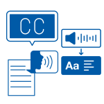
Captioned Videos and Audio Transcripts
- The Goal: Provide synchronized text for videos and full text versions of audio files. Captions must accurately reflect technical jargon, acronyms, and coding syntax to be truly “perceivable” and useful.
-
The Standards (WCAG 2.1 Level AA):
-
Pre-recorded Media: Must have accurate synchronized captions and an audio description for visual content
-
Live Streaming: You must use a live captioning service or high-quality automated software that can keep up with live speech.
-
Audio-Only: Must provide a full text transcript for podcasts or recorded lectures
-
- Why it Matters: It provides access to users who are deaf or hard of hearing and benefits all users in “silent” environments (like a library) where they cannot play audio out loud.
-
Best Practice: Use high-quality captions (avoid “auto-generated” without editing them) and place transcripts near the media player.
Complex Data and Document
This section ensures that the information within structured data and standalone documents is digitally “visible” and can be accurately translated by assistive technologies.

Tables
The Goal: Use tables for data organization, not for page layout.
Why it Matters: Without headers, a screen reader user hears a flat list of numbers and words with no way to tell which column or row those data points belong to.
Best Practice: Include header rows and/or header columns so data is associated with a specific category.

PDFs
The Goal: Ensure all uploaded documents are “Tagged” for accessibility.
Why it Matters: Tagged PDFs allow assistive software to follow a logical reading order and identify headings, links, and images, whereas an untagged PDF is often completely invisible to a screen reader.
Best Practice: Export PDFs from source files (like Word) with “Accessibility Tags” enabled rather than scanning them as images. You can also use tools, such as Adobe Acrobat Pro, to auto-tag your PDFs. Grackle Go can also scan your PDFs to determine whether they are compliant.