
Robust: Build for Compatibility and Longevity
The fourth and final pillar of accessibility is Robustness. While the other principles focus on how a user sees, moves through, and understands a site, the Robust principle focuses on the technical foundation that enables those experiences.
A Robust website is compatible with the widest variety of technologies, now and in the future. This means our digital tools are built to be “future-proof.” Whether a student is using a specialized screen reader, an older library computer, or the latest smartphone, a Robust site ensures that our content remains stable, functional, and accessible.
By following strict coding standards and carefully vetting our external partners, we ensure that technology remains a bridge to learning, rather than a barrier
Why these topics fit under Robust
Technical Reliability
Robustness is defined by how well a site “parses” (reads) its code. Assistive technologies, like screen readers, are very literal. They aren’t as smart as the human eye at “guessing” what a broken layout is supposed to look like.
By having clean “digital grammar,” you ensure the foundation is strong enough to support any assistive device, preventing the site from “crumbling” when a screen reader tries to translate it.
Device Flexibility
A core requirement of the Robust principle is that content must remain accessible as technologies and browsers evolve. If a site only works on one specific version of Chrome, it isn’t “Robust”, it’s fragile. By testing across various screens and browsers, you are proving that your site is sturdy enough to handle the fragmented world of modern hardware without breaking the user’s experience.
Reliable Partnerships
A website is often a “collection” of different tools (videos, forms, chatbots). The Robust principle requires that the entire package remain functional for the user. Accessibility is only as strong as its weakest link. If you integrate a third-party tool that isn’t accessible, you’ve created a “soft spot” in your Robustness. Vetting vendors ensures that the entire technical ecosystem is solid and reliable for the student.
Technical Reliability
Name, Role, and Value
- The Goal: To ensure that the content added to the site or application doesn’t “break” the way assistive technology communicates with the browser.
- Why it Matters: Even if the website itself is well-built, a user can accidentally make it “unreliable” by pasting in messy text from Word, using custom buttons that aren’t labeled, or creating complex layouts that a screen reader can’t follow. This causes a “broken link” between the information and the student’s tools.
- Best Practice:
- Check for “Hidden” Code: When copying text from Microsoft Word or another website, use “Paste as Plain Text” to avoid bringing over “invisible” formatting that confuses screen readers.
Interactives: (buttons, links, form fields) must clearly communicate three things to assistive technology
Name: What is it called? (e.g., “Submit Application”)
Role: What is it? (e.g., “This is a Button” vs. “This is a Link”)
Value/State: What is it doing right now? (e.g., “The checkbox is checked” or “The menu is expanded”
Consistent Navigation
The Goal: To keep global elements (the “furniture” of the site) in the exact same physical location across all pages.
Why it Matters: Users with low vision, who may use screen magnifiers, only see a small portion of the screen at once. If the “Search” bar moves from the top-right to the sidebar on a different page, they have to “hunt” for it all over again. Consistency allows users to navigate by muscle memory.
Best Practice:
Persistent Header/Footer: Ensure the main menu, logo, and contact info are identical in placement on every sub-page.
Standardized Search: Keep the search input in the same relative position (e.g., top right).
Consistent Sidebars: If a department page uses a left-hand navigation menu, it should appear on every page within that section.
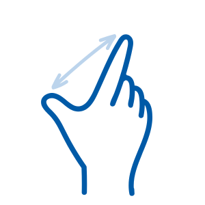
Responsive Design and Zoom
The Goal: To ensure that when a user enlarges the text or “zooms in” for better visibility, the content stays readable and stays within the bounds of the screen.
Why it Matters: Many students with low vision don’t use a screen reader; they simply use the browser’s “Zoom” feature (up to 400%). If a site isn’t “Responsive,” zooming in makes the text run off the edge of the screen. This forces the student to scroll left-to-right to read every single line of a sentence, which is like trying to read a book through a straw.
Best Practice:
The 400% Reflow: Ensure that when zoomed to 400%, the page automatically “reflows” into a single column so the user only has to scroll up and down.
Text Scaling: Ensure that text size is defined in relative units (like percentages) rather than fixed sizes, so it can grow or shrink smoothly.
No Overlap: Check that as text gets larger, it doesn’t “break” out of its container or overlap with images or other text.

Cross-Platform Consistency
The Goal: To ensure that elements that look the same, act the same.
Why it Matters: Predictability reduces the “cognitive load” or mental effort needed to use the site. If a student learns that a “Blue Button” always submits a form, but on the next page a “Blue Button” deletes their work, it creates a high risk of error and frustration.
Best Practice:
Unified Component Library: Use a single CSS style for primary actions (Submit), secondary actions (Cancel), and destructive actions (Delete).
Icon Standardization: If a “pencil” icon means “Edit” in the student portal, don’t use it to mean “Write a Review” elsewhere.
Predictable Link Behavior: Don’t trigger a download or a new window without a text warning (e.g., “Syllabus – PDF”) so the user knows what to expect when they click.

Screen Size Capatibility
The Goal: To ensure the website layout automatically reshapes itself to be fully functional on everything from a massive desktop monitor to a small smartphone.
Why It Matters: This is about physical access. A student might start an assignment on a lab computer but finish it on their phone while waiting for a bus. If the “Submit” button only appears on the desktop version, or if a table is too wide for a phone screen, the student is physically blocked from completing their work based on the device they own.
Best Practice:
The “Mobile-First” Layout: Design pages so that they look great on a small screen first; they will naturally scale up to larger screens more easily.
Touch-Friendly Targets: Make sure all buttons and links are large enough (at least 44×44 pixels) so they can be tapped easily with a thumb on a small screen.
Adaptive Menus: Ensure your navigation menu switches to a “mobile-friendly” version (like a hamburger menu) on smaller screens so it doesn’t crowd out the content
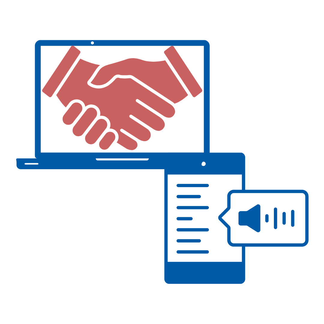
Reliable Partnerships
Reliable Third-Party Compliance
The Goal: To ensure that every external tool, plugin, application, or software integrated into the district is accessible.
- Why it Matters: The tools you use are an ecosystem. If your main page is perfectly accessible, but the third-party application doesn’t work with a screen reader, the student is still blocked. We are responsible for the entire user journey. As educators, we must ensure that the “digital vendors” we bring into our classroom aren’t creating barriers for our students.
Best Practice:
Request a VPAT: Before using a new tool, ask the vendor for their “Voluntary Product Accessibility Template” (VPAT). This is a standard document where they disclose exactly how accessible their product is.
Test the “Bridges”: Don’t just take the vendor’s word for it. Try to navigate the external tool using only your keyboard to see if it’s possible to complete the main task (like submitting a quiz or playing a video).
Prioritize Accessible Alternatives: If a tool isn’t accessible (e.g., a video player without caption support), look for a “Reliable Partner” who prioritizes inclusive design.
Check the “Embeds”: If you embed a map, a calendar, or a social media feed, ensure it doesn’t “trap” keyboard users (where they can get into the map but can’t get back out to the rest of the page).
Third-Party Information
Search the Repository
Check our Accessibility Repository to see if a current VPAT or Accessibility Statement is already on file for your tool.
Request a Review
If the tool is not listed, use the Vendor Review Request Form to initiate a new accessibility check.
Contact the Vendor
If you are in direct contact with a vendor, please provide them with our Vendor Submission Link so they can upload their latest documentation directly to our database.